 Second Life Selling Tip 11 of 15: Avoid Product Art Clutter
There are three kinds of product art in Second Life: good ones, not good ones, and liars. The good one clearly make the product of concern the main focus. The liars will touch-up their art through post-processing to make the product appear better than it really is. The "not-good" ones tend to be rather cluttered and become counter-productive.
The same is true for your advertisement posters and marketing materials, especially when you have them placed all over the grid.
I have run across many products where the promotional art (vendor picture) was abysmal, but the product just stunning in quality and value. And vice versa. The worst of the bunch are those which are 'doctored' (a.k.a. "photoshopped") - meaning that the product is intentionally made to look better than it really is by methods such as adding glow, lighting starbursts, softening focus and all that nonsense. [Clarification: I mean "photoshopped" on the product itself - not the changing-out of backgrounds and other methods.]
The best product art shows only the product, practically nothing else. Preferably against a neutral background. The best way to accomplish this is to zoom-in on the product (CTRL-0 key). Have the product fill the entire 800x800 (XStreet SL) and 256x256 (in-world) frames. If you are selling shoes, have the entire shoe fill the picture area. Be sure the picture isn't distorted - but displayed at the proper aspect-ratio.
A good angle is from about 45-degrees to the left or right and slightly (perhaps 10 to 15-degrees) above. The art should not have a lot of text on it - just a simple title of the product, style (such as color) - permissions and maybe three or four feature bullets. Leave the rest to the notecard - including the price. The art's only purpose is to intrigue the shopper just enough to view the notecard.
 Think about it: in a market with all the loud, psychedelically colorful product art blasting from a wall of vendors, which ones jump-out and grab your attention first? Often it will be the simple, plain, neutral-colored ones because all the others are too loud and fighting each-other visually. If optimized for download (256x256 in pixel dimensions) they also will rez faster than all the others. Not to mention I can clearly see the product from a greater distance away, I am more likely to be curious about it enough to take a closer look.
So for your product art, here is what actually works very well, especially in crowded vendor-ridden places:
The product and only the product in the image - and filling almost the entire picture
A bright neutral - even plain white background
Clear description of permissions
Only a few feature bullets and style (such as color) differentiator
Low-resolution for fast download and rezzing (256x256)
In other words: unclutter your product art for highest-impact and best effect as in a world full of visual shouts, the whisper stands-out the loudest.
**********
Want the whole kaboodle? There is far more detail in the 'how' and 'why' in my book: Successful Business in Second Life (SBSL - Second Edition for 2009/10; 270-pages) is available at XStreet SL. The book includes both, an in-world and eReader version. There also is an Amazon Kindle version, (you receive both: ereader and in-world versions no matter where you purchase it.)
Now, all you prim-attachment creators: there is a dire-needed discussion awaiting about the sizing flexibility of your creations..
The same is true for your advertisement posters and marketing materials, especially when you have them placed all over the grid.
I have run across many products where the promotional art (vendor picture) was abysmal, but the product just stunning in quality and value. And vice versa. The worst of the bunch are those which are 'doctored' (a.k.a. "photoshopped") - meaning that the product is intentionally made to look better than it really is by methods such as adding glow, lighting starbursts, softening focus and all that nonsense. [Clarification: I mean "photoshopped" on the product itself - not the changing-out of backgrounds and other methods.]
The best product art shows only the product, practically nothing else. Preferably against a neutral background. The best way to accomplish this is to zoom-in on the product (CTRL-0 key). Have the product fill the entire 800x800 (XStreet SL) and 256x256 (in-world) frames. If you are selling shoes, have the entire shoe fill the picture area. Be sure the picture isn't distorted - but displayed at the proper aspect-ratio.
A good angle is from about 45-degrees to the left or right and slightly (perhaps 10 to 15-degrees) above. The art should not have a lot of text on it - just a simple title of the product, style (such as color) - permissions and maybe three or four feature bullets. Leave the rest to the notecard - including the price. The art's only purpose is to intrigue the shopper just enough to view the notecard.
Think about it: in a market with all the loud, psychedelically colorful product art blasting from a wall of vendors, which ones jump-out and grab your attention first? Often it will be the simple, plain, neutral-colored ones because all the others are too loud and fighting each-other visually. If optimized for download (256x256 in pixel dimensions) they also will rez faster than all the others. Not to mention I can clearly see the product from a greater distance away, I am more likely to be curious about it enough to take a closer look.So for your product art, here is what actually works very well, especially in crowded vendor-ridden places:
The product and only the product in the image - and filling almost the entire picture
A bright neutral - even plain white background
Clear description of permissions
Only a few feature bullets and style (such as color) differentiator
Low-resolution for fast download and rezzing (256x256)
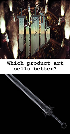
Image: both are selling similar products... a sword. Which of these actually grab your attention better?
In other words: unclutter your product art for highest-impact and best effect as in a world full of visual shouts, the whisper stands-out the loudest.
**********
Want the whole kaboodle? There is far more detail in the 'how' and 'why' in my book: Successful Business in Second Life (SBSL - Second Edition for 2009/10; 270-pages) is available at XStreet SL. The book includes both, an in-world and eReader version. There also is an Amazon Kindle version, (you receive both: ereader and in-world versions no matter where you purchase it.)
Now, all you prim-attachment creators: there is a dire-needed discussion awaiting about the sizing flexibility of your creations..
blog comments powered by Disqus
Subscribe to:
Post Comments (Atom)